District
DANSKE BANK
Background
Danske Bank is one of the biggest banks in the Nordics, providing services and digital solutions to both private and business customers. In the business sector, Danske Bank was providing a lot of smaller, targeted digital products to narrowed parts of the customer base. To ensure that no customers were underserved and to mitigate the technical legacy, direction was set to envision a new platform to serve all its business customers – from Small business owners like the shop on the corner to the big corporations across Europe.
2017
Problem
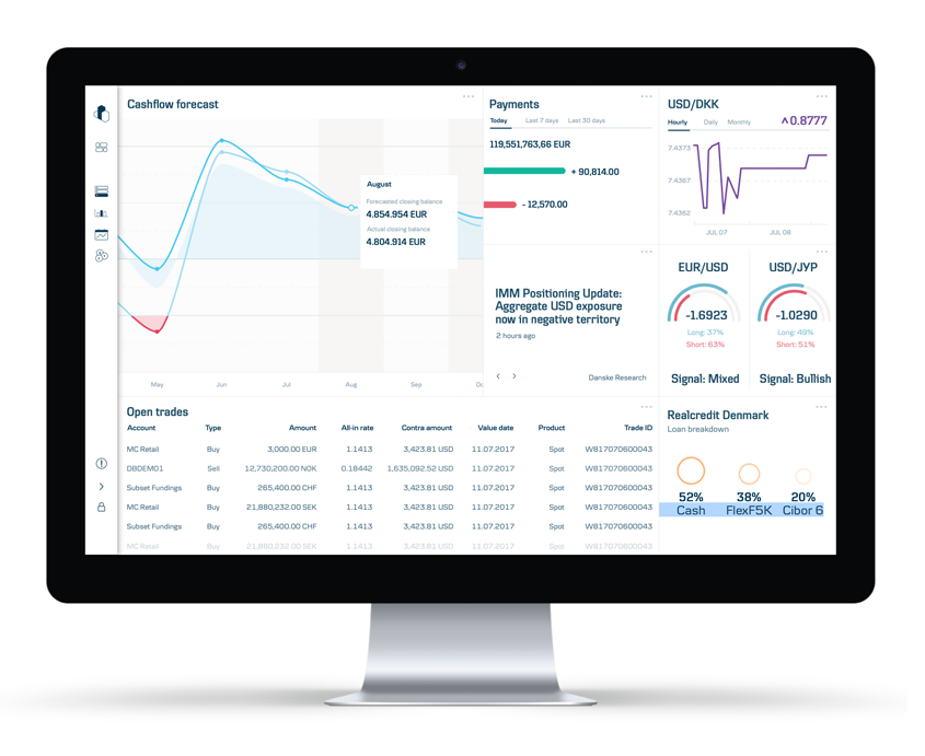
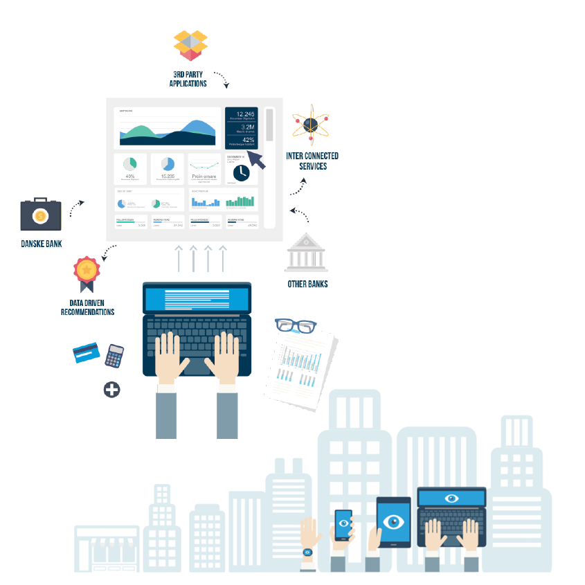
As Head UX for Business banking, my team was responsible for the development of the experience vision for the new product, called District. District is a customizable platform for businesses, to encourage making better financial decisions.
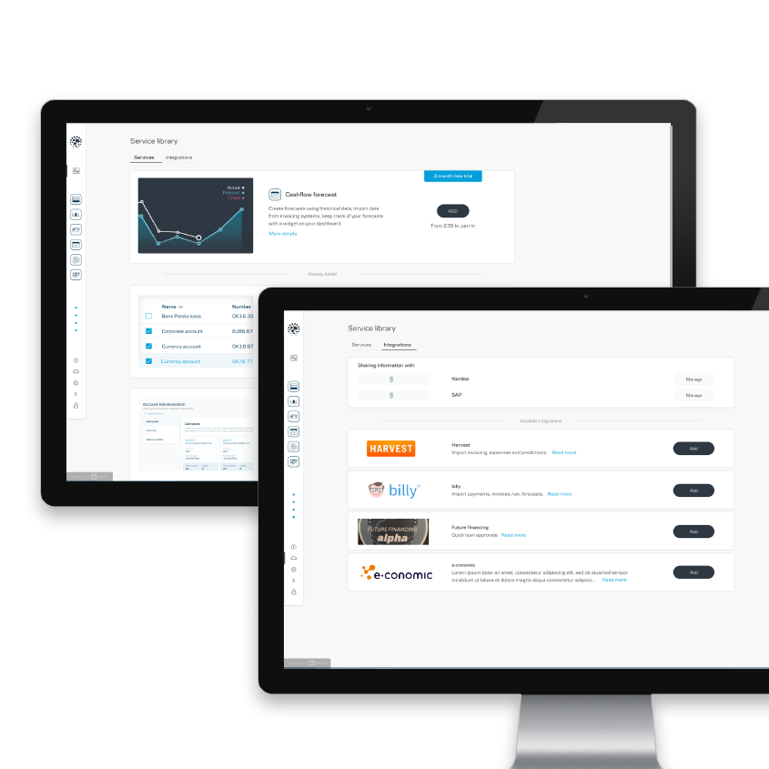
With District, it should be easy to manage daily banking business and by adding and removing modules on top of the standard solution, a platform can be created that matches the needs of every individual customer.
Design
I worked with a small team of designers to focus on the navigation of the product, transitions between modules and going from Dashboard to ‘deeper’ parts of the product.
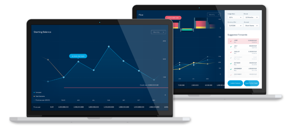
We spend a lot of time on the design of the Dashboard, to ensure all widgets can be optimized to show a specific relevant data set, personalize it to customer needs and provide options to change filters on the fly.
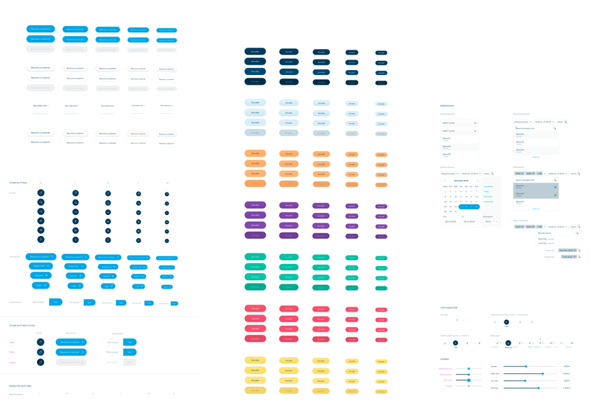
Design System
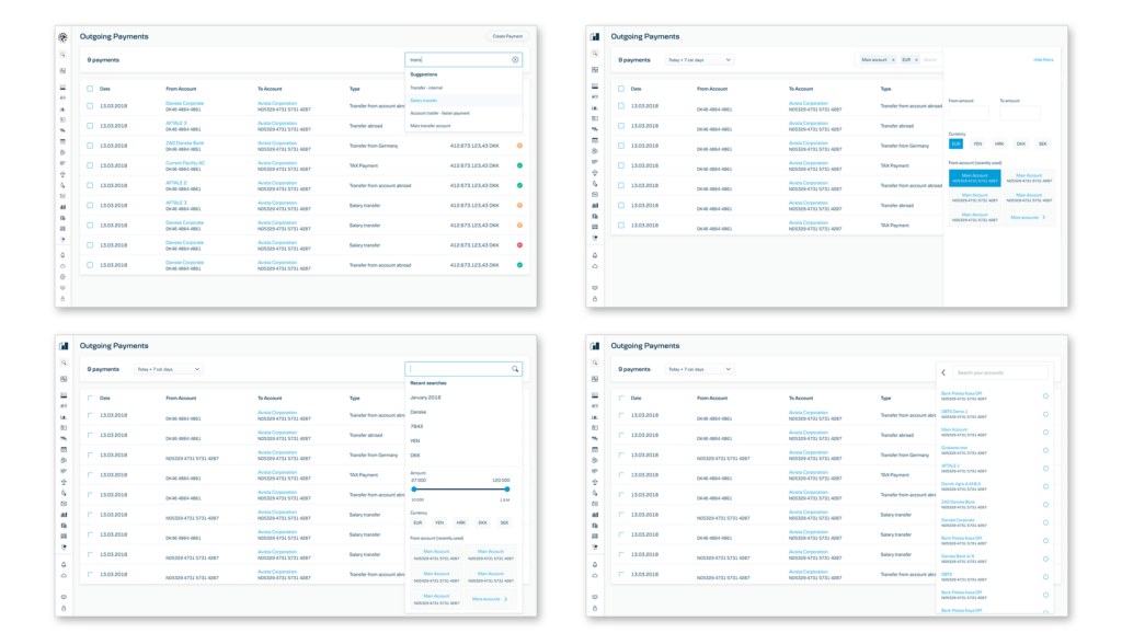
Danske Bank has a mature design system from the personal banking design teams. My team was responsible to align with the design system but enhance it and optimize it for business use. There was especially a lot of additional design work needed in areas of working with tables, grids, charts and providing easy-to-grasp screens for complicated workflows.
Categories
Web, Finance
